Archive for the ‘Before & After’ Category

GREAT STAGING SELLS – HOME SOLD IN 5 DAYS!

When it comes to a well designed space and creating flow between rooms, the principles of Home Staging are a good source for inspiration!

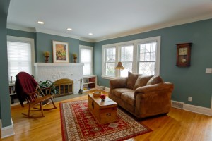
This sweet little tudor is a great example. As a class project it was perfect! Nice features, but hard to see under a frumpy furniture layout. We came in and re-vamped it for amazing results!

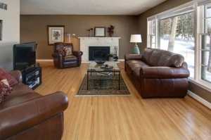
The sofa was originally blocking the view, and there was a large area rug concealing the hardwood floors. Over the mantel, nothing special made the fireplace stand out. We redirected the layout to highlight the fireplace & hardwood floors!


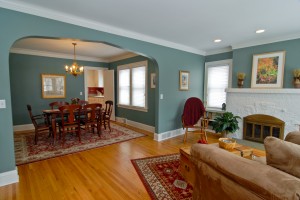
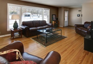
From this view, it is easy to see how open the space looks! The table was repositioned horizontally to create a more proportionate layout. This is the view buyers will see from entering the front door!
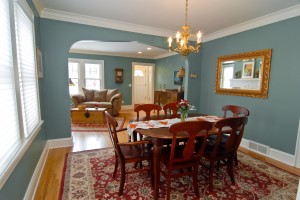


Looking from the dining room to the living room shows you what a difference it made to move the buffet to the living room and reposition it near the front entry. This space previously was bare…and made the entire living room feel off-balance. Moving the buffet out of the dining room also made the dining room look much larger!


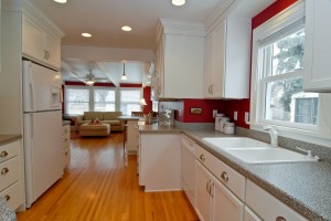
This bright and cheerful kitchen had undergone a recent renovation. It was easy to stage! We just cleaned up the countertops and accessorized!
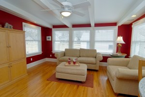

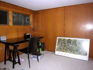
To make the family room feel larger and more user-friendly, we removed an area rug that covered the entire floor, added a sweet little antique table brought in from the living room, and brought in a lamp. The end result was a small addition that felt twice the size!
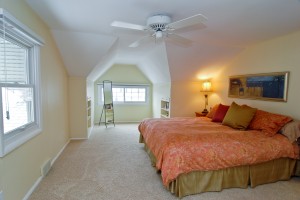
                                                                                                     Admittedly, not everyone is going to be a fan of these slanted ceilings! To make it feel more open and airy, we got rid of everything…bins, temporary storage, etc….that was blocking the flow, then added colorful bedding (found in the closet) and colorful artwork (found leaning up against the wall.) to create a more luxurious feel and take away attention from the low ceiling height!

While I am not totally opposed to a TV in the bedroom, we did make it look a little neater by removing the tv stand and using a small dresser, instead. Moving it down the wall a smidge…rather than it’s previous spot at the end of the bed…gave buyers room to walk through and visually made the space feel larger. A comfortable chair and ottoman…too boxy and large for the living room…added to the ‘master suite’ feel!

Want to learn the art of Staging a Home to Sell? We have another 4-Day Workshop coming up in Minneapolis in May, and a 2-Day Workshop coming to New York City in June! Check out our calendar for workshops coming up around the country at www.homestagingexpert.com!

Post to Twitter

How To Make Love to Your House

May

02 2011

4-Day Workshop – Minneapolis, MN

Staging a Vacant Home, Staging an Occupied Home, Interior Redesign, and Business & Marketing…we cover it all!  Sign up for the most COMPREHENSIVE workshop in the industry, limited to 6 for individual benefit.   $1499.00 per person

Includes manuals, starter kit, lunch, and lifetime listing at www.homestagingexpert.com  Sign up now to start a successful career and be your own boss!

BEFORE


AFTER

Post to Twitter

How To Make Love to Your House

Apr

26 2011

Design – “Sold in Just Two-Weeks!”

One of the saddest aspects of my job as a Home Staging Expert is the fact that I just meet too many people who’ve wasted too many good years with a house they didn’t love.  Unfortunately, I am usually called in as a last resort, when they’ve finally given up and decided it’s time to move on.  Of course this often walks hand-in-hand with one of the happiest moments for me, as in this case, when the house sells within two-weeks of putting it on the market!  So the sad yet happy truth is…while the former owner could no longer see the potential (until I arrived, that is), the new owner could and was more than happy to make the commitment!  (Click on photos to enlarge!)

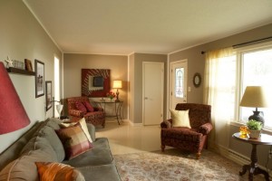
When I arrived, both the sofa and the loveseat were pushed up against the window and the chair was shoved in the back corner, a large rug and heavy wooden coffee table were hiding the floors, the fireplace was buried under clutter, and there was no lighting or artwork to be found!  The entire house looked a little depressing to me…definitely just a house and not a home!  (PS – I found the heavy resin lamp at a yard sale for $2.00, spray-painted it green, and added a new shade!  Does it rock this room, or what?  The perfect touch of color!)

By giving the living room a more pleasing layout, I was able to make the space feel more inviting!  To make the house more welcoming and add a sense of style to the space, I traded out the oversized rug for something less overwhelming, swapped the heavy wood coffee table for a glass table I found on the lower-level, added artwork and throw pillows for color, then balanced out the lighting!

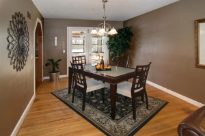
To add a little excitement to this basic dining room, I teamed the larger area rug that had been previously weighing down the living room with the owner’s beautiful dining room set and placed them both on an angle.  The fun mirror also belonged to the owner, as well as the greenery.  For a pop of color, a simple centerpiece was created using an embossed bronze tray, lemons, a couple of glasses and a bottle of vino!  🙂

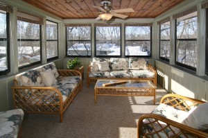
The sunroom was the easiest to stage!  I just got rid of all the clutter and gave the space the most functional layout possible…then added a basket full of happy greenery to draw the buyer’s eye through to the furthest corner of the space.

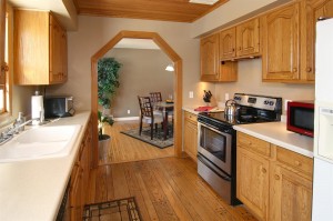
In the kitchen, a new stainless steel stove replaced the one that didn’t work and matched the existing stainless steel dishwasher.  (PS – Doesn’t the dining room look HOT from this view?)

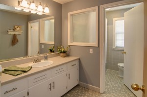
Dated tile floors look  new with a complimentary paint color on the walls!  (So here’s a tip…whenever you want to downplay flooring, be it dated tiles or carpeting…a paint color that blends rather than a contrasting color will do the trick!)

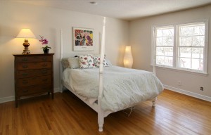
The bedroom was given a neater appearance!  By moving one of two dressers that had previously taken up the far wall, I was able to simplify the look.  Then, a dash of color…in artwork over the bed, with throw pillows on the bed, and a silk orchid on the dresser…gave it just the right amount of ‘va-voom’ to make it inviting!

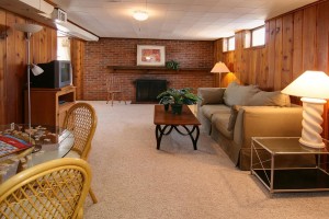
The lower-level family room turned out great!  Flipping the coffee tables made a big difference.  The wooden coffee table made so much more sense down here!  The wood helped balance out those heavy bricks.  And kindly note that scrabble game on the rattan table (moved downstairs from the previously cluttered sunroom)…I spelled out “Buy this house” on the board!

And guess what?  Someone did…in just two weeks!  Did I mention?  🙂

Want to learn how to stage a home for market?  Go to www.homestagingexpert.com and sign up for our Home Staging – Home Study Course!  Only $299.00 and includes a lifetime listing on our website!


Post to Twitter

How To Make Love to Your House

Mar

08 2011

Design – “A Rough Rambler Settles Down!” Part III


The end result is a wonderful, happy space that is as perfect for the owner as the owner is for the space!

Post to Twitter

How To Make Love to Your House

Feb

16 2011

Design – “A Rough Rambler Settles Down!” Part II


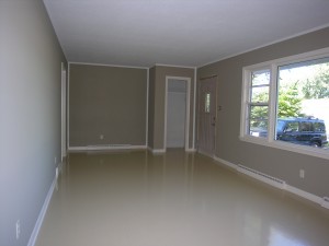
After sanding the floors twice, it was determined they could not be salvaged as originally intended.  However, replacing them at this point…the house had just been purchased and the entire place needed updating to even make it livable…we decided that was not a financial option.  But PAINTING the wood floors was a nice alternative.  (See February 5, 2011 posting on painting wood floors.)

To give the entire room a nice, fresh appearance, the trim was also painted in off white, and the ceilings got a fresh coat, too.  (Use Kilz brand paint to kill odors!)  To make this simple space feel more detailed, the corners and edging around the top and bottom of the wall were also painted the same color as the ceiling.  After drying overnight, the edge was taped off along the perimeter using 1 1/2 inch painter’s tape before the walls were painted khaki tan.  (If you don’t want to worry about hitting the ceiling with the roller, use 2 inch painter’s tape instead.)  The end result gave the room a sense of definition for less.

Watch for “A Rough Rambler Settles Down!” Part III.


Post to Twitter

How To Make Love to Your House

Feb

09 2011

Design – “A Rough Rambler Settles Down!” Part I

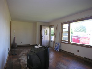
Abused by it’s former owner, this three-bedroom rambler had already lived a lifetime of mistreatment and succumb to a few gnarly cats when it finally met the owner of it’s dreams!  While most would have given up on this hapless home, someone came along with just the right vision and vowed not to give up on the space.  After ripping out soiled carpeting and dumping the smelly contents the previous tenants left behind, a thorough cleaning and de-stinking were part of the initial courtship to get this relationship heading in the right direction!

If you’re wondering where this romance is going, keep in touch and watch for “A Rough Rambler Settles Down!” Part II  (Also see ‘How to Paint Wood Floors!’)

Post to Twitter

How To Make Love to Your House

Feb

02 2011